
By Ravi Suhag
At GO-JEK, location is built into the fabric of all our products, powering dozens of products that are used by millions of customers and drivers, daily.
Here’s a tweet from one of our investors from when this post was written to help contextualise our scale.
Incredible board mtg at @gojekindonesia y’day . It’s unreal that the app launched 3 yrs & 2 weeks ago:
— Shailendra J Singh (@singh_sequoia) February 15, 2018
~100M orders/mo
~ 14 orders/mo for wallet users
~$5B payment vol RR
~ 700k active drivers, 125k merchants
~$2B raised
- a new platform playbook
- leadership across categories
As a result, we have billions of GPS points flowing through our data pipelines daily in real-time. This data drives decisions like driver allocation, surge pricing, driver incentives and many more.
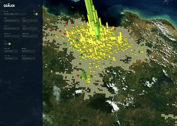
At GO-JEK’s Data Engineering team we built Atlas in an attempt to make it easy for teams within GO-JEK to visually explore this flood of geospatial data. For example:
- Our City Ops teams need to have near real-time information of the current supply and demand distribution.
- Our Data Science team needs rich exploratory interfaces to tackle multidimensional data for experimental analysis.
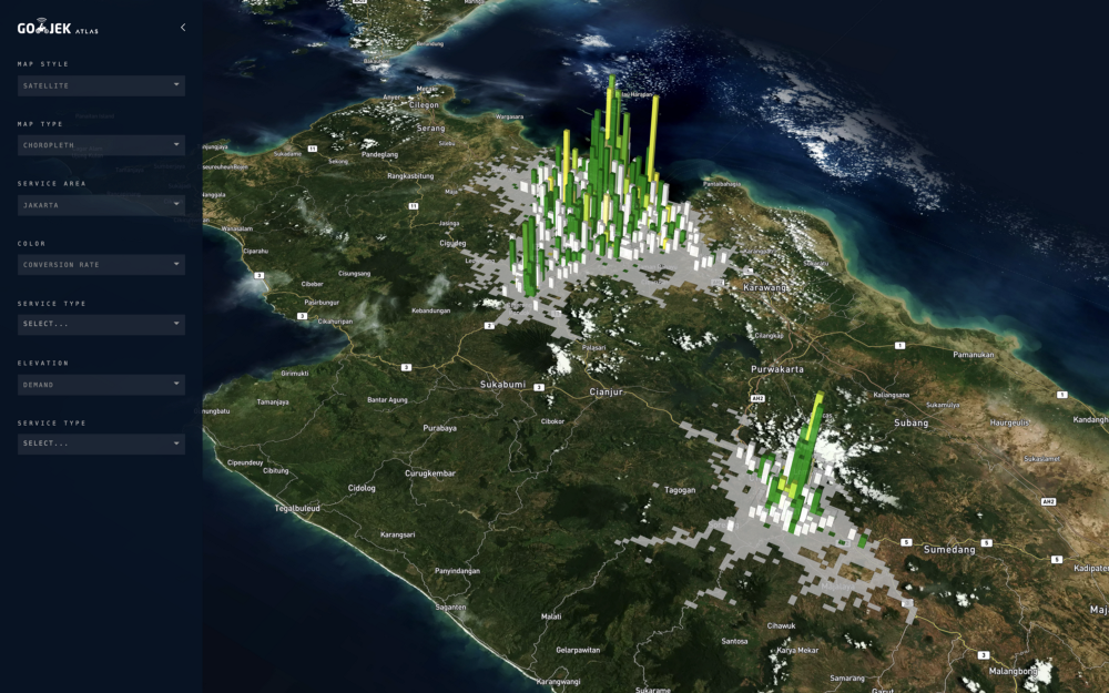
Enter Atlas
Atlas is our geo visualization platform for exploring and visualizing location data sets at scale. It is made possible by several internal products and tools we’ve developed over the last 18 months.
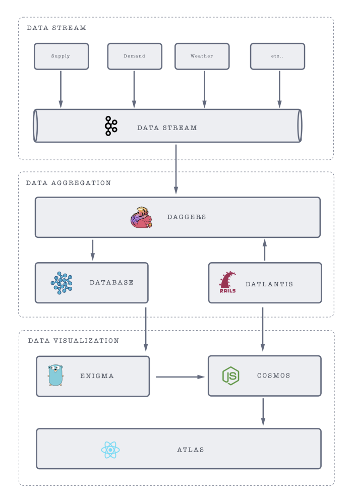
- Billions of raw data points representing active driver and customer locations are ingested in real-time into a pipeline built on top of Kafka.
- This raw data is aggregated by Daggers, our real-time streaming aggregation and analytics platform powered by Flink.
- Datlantis is a user friendly interface to a fully automated system that creates and deploys custom streaming aggregation on top of Daggers. This allows us to create and deploy massive, production-grade real-time data aggregation pipelines in minutes using a SQL-like syntax. The results are written to a time series database.
- Enigma is a metrics query engine to access time series data with powerful functions to aggregate, filter and analyze.
- Cosmos is the configuration service which holds mappings of Atlas visualization layers and Dagger metrics. More on this later.
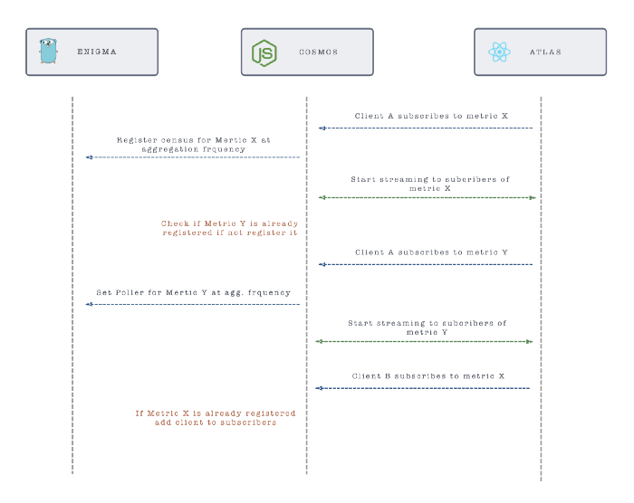
Metric streaming
Data flow from Enigma to Atlas clients uses a combination of HTTP long polling and web sockets to improve performance and reduce load.
The frequency of HTTP long polling between Enigma and cosmos is decided by the Dagger metric aggregation window. This makes data on Atlas as real-time as your aggregated metric.
Cosmos tracks the metric census, subscribers and channels for all the clients. The client can subscribe to any number of metrics which are then served by cosmos to Atlas via web socket streaming.
Dimension mapping
The Cosmos sub-system of Atlas make for a great deal of flexibility in rendering location data. It provides an interface to defining metrics models and layers. This lets users map data into the structure required by the visualization layer of Atlas.
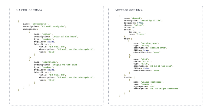
The metric model holds all information related to the data metric. e.g. supported data types, filters, aggregations windows. For each Dagger created through Datlantis, there is one associated metric model in Cosmos.
A layer schema holds information about visualization layer and its dimensions — e.g. colour and height.
Dimensions of a layer are the visual variables which can hold and visualize supported metrics. Each dimension can support one or more metrics. For e.g. on a 3D choropleth, color and height are the two dimensions which can be used to display data.
This structure enables anyone to
- Augment their own visualization layers tailored for a specific use case.
- Create and publish dagger metrics dynamically to Atlas for everyone to consume.
- Allow other teams to host their own Atlas instance for focussed use cases.
Data experience
- Layer selection: Pick your own visualization layers as per your use case. Build heatmaps, data clusters, 2D/3D choropleths, and more.
- Metric selection: Flexible mapping of dimensions and data metrics allow exploratory analysis to seamlessly integrate into each team’s data analytics needs.
- Cell Panel: Atlas also allows you to explore detailed data of layer’s cell. e.g. number stats, histogram. Each layer can interface with cell panel and provide detailed information about the cells (e.g. S2 Id).
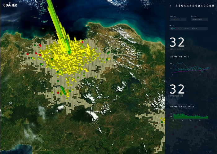
- Area Navigation: You can smoothly pan across different service areas all across Indonesia.
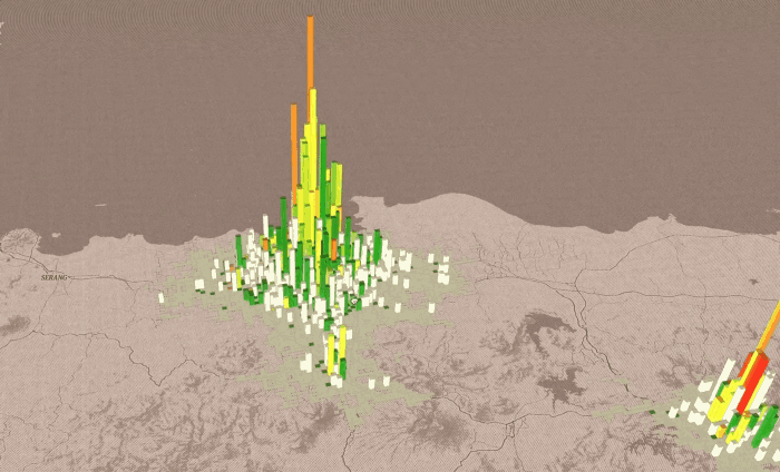
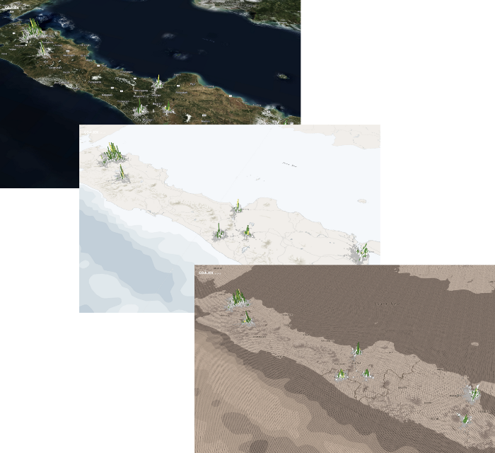
Map Style: Atlas allows you to quickly switch between map themes without a need for remapping dimensions or data reload. Each map theme is designed to focus on certain properties like roads, area boundaries etc.
Want to Learn More?
Our tech stack for Atlas consists of few open source libraries including React, MapboxGL and deck.gl. Our data pipeline uses Kafka, Flink and some other big-data frameworks. Other microservices are written mainly using Clojure, GoLang, Ruby and (more rarely) NodeJs.
If you like what you’re reading and interested in taking on some of these challenges with our team, do check out our engineering openings at gojek.io. As always, would love to hear what ya’ll think 🖖
