By Fatema Raja
Hello there,
Today, we’re announcing one of the biggest changes in Gojek’s short but impactful history.
We have a new look! And this introductory post is here to shed some light on the why.
Just like you and me, brands grow, change, and adapt to the world around them. Gojek is one of the most-loved brands in Indonesia. Since launching our first app in 2015, Gojek has grown — a lot. While we’ve shared many stories about how different systems in Gojek adapted to our unprecedented scale, there is one thing that remained the same — our brand language.
First, the logo
Our logo precedes our app. When it was made, nearly 9 years ago, it symbolised a marriage between an Ojek (a Bahasa Indonesia word for bike taxis) and technology (symbolised by the wifi symbol atop). After all, moving people about on Ojeks was what we started with. It was conceptualised and finalised in an evening, by none other than one of our founders! Oh, the joys of starting-up!
A good logo should be unique. And on that point, our logo did deliver. That, and the love that our users showed our products, made it truly iconic.
But… being unique isn’t everything a good logo is supposed to do. We struggled in more ways than one. Our logo was hard to see at small sizes. It wasn’t flexible enough, and its complex shape made it hard to recreate in different materials, basically very easy to mess up.
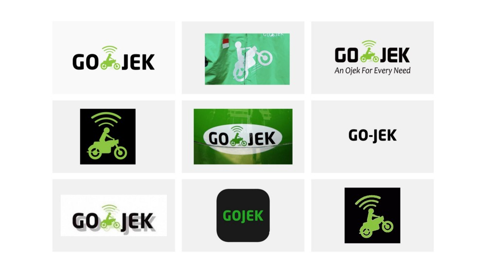
Another point of contention was the meaning inherent in our logo. We realised that seeking meaning in your logo may also put an expiry date on it. While Gojek started with and still continues to be an online ride-hailing app, our mission has extended far wider today. And our logo — iconic as it was — would sometimes get in the way.
Of course, a brand is more than a logo.
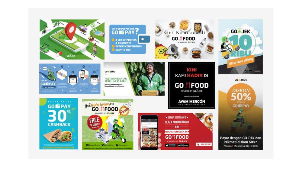
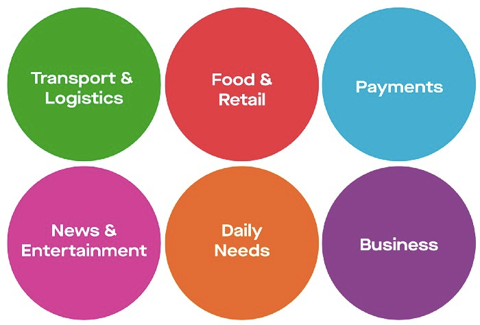
If the logo needed updation, the rest of our brand language needed a refresh too. Gojek is an app of apps. A SuperApp. We have more than 20 products and services. So many, that we were literally running out of colours to attribute to new products. Our colours needed a rethink. Our typeface looked dated, and struggled to provide enough variety with its limited range of weights. So did the illustration style, the tone of voice, and everything else…
We’ll let images do the talking
Bottomline, we needed to change. We needed a look that would reflect why we exist, what we believe in, and where we’re headed.
We knew this was going to be hard.
Designing a holistic and cohesive brand system that stretches across 20+ products and multiple countries is a challenge. We needed a complex brand architecture that would accommodate all our sub-brands, and have room to spare.
The design team at Gojek had had enough time to think about this. We knew that making the system was one thing. Evolving it would be far more challenging. For a company and a brand that moves as quickly, we needed to invest in the required skills so that we can not only build Gojek’s brand system, but also keep evolving it.
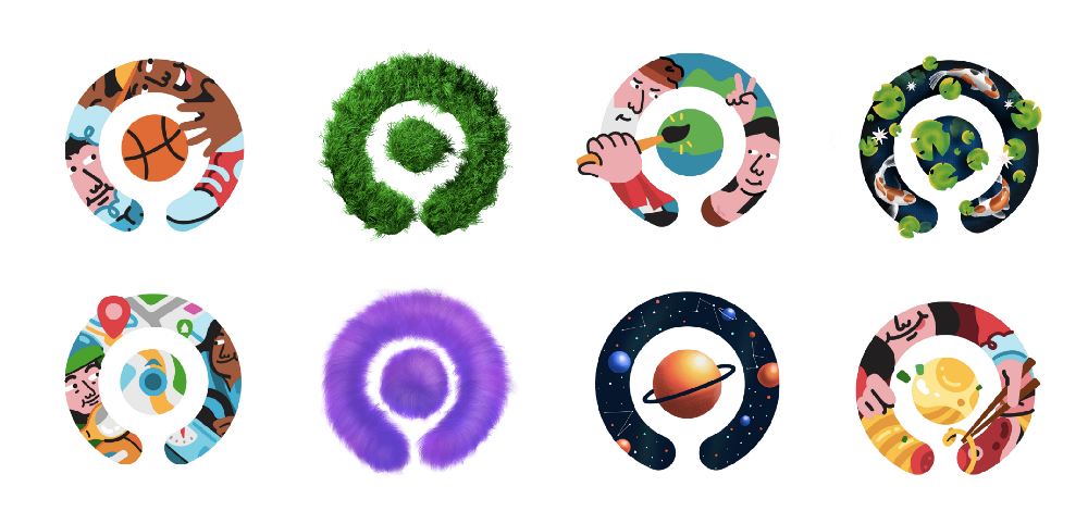
We started where every design project at Gojek starts — with our users and drivers. After months of research, intense brainstorming, dozens of fully-built decks that were shelved at the last moment… we arrived at Solv — our new logomark. We call it our symbol of solutions.
Solv fit our definition of a perfect logo. It was unique enough to stand out from the competition, memorable enough for anyone to redraw from memory, and still flexible enough to work at any size, anywhere. And the team loved it.
Just like Gojek, Solv evoked different emotions in everyone who saw it, a logo that lets you decide the meaning:
- Some saw a power button in it, identifying with Gojek’s mission — to empower people to live a hassle free life.
- Some saw a search icon in it — Search for anything with Gojek.
- Some saw a map pin — we’re there for you no matter where you are.
- For some, it was a top down view of a Gojek driver — a tribute to our heroes who help get things done.
Fun fact: You can also find Solv in our original logo. Let us know if you spot the connection!
With the logo done, we were about 5% done with our rebrand
There was a lot more to do. So we moved on to the next big challenge — colours. Perhaps the most important aspect of any brand. And for Gojek we were running out of unique colours to associate with new products . From a confusing mishmash of multiple colours and products, we now have an altered palette of six.
Six simple colours categorising our many product offerings.
Then came typography, photography, illustration style, tone of voice, composition and layout, iconography, and sonic branding. All of this, the sub-brands, and a lot of iterations became a 200+ page brand book. A living document, to reaffirm our identity beyond just a ride hailing app — as a platform to help you solv every problem that gets in the way of your progress.
In short, we’ve made changes to represent Gojek the way we believe it deserves to be seen. This journey has been nothing short of a rediscovery for us, a labour of love, sweat, and tears. We really hope you like it .
We can’t wait for you to see these changes in the real world, and in our products. Meanwhile, watch this space for more deep dives into what it took to get this done! We’ll be writing a lot more about our design philosophy and process of bringing this to life.
With Love
Gojek Design Team

Want more insights into how we do what we do? Sign up for our newsletter.