By Fatema Raja
In 2017, GoFood had a total of 157,000 restaurants and 75,00,000 dishes. Our daily orders were growing at 4x every MONTH. We were onto something big.
Though our orders were off the charts, users were taking an average of 12 minutes per order. This was a tad high, but not exactly worrisome, considering our order volume was spiking.
By mid-2017, the average time increased by another 30 seconds.
But since our orders were still climbing…
It was one of those unspoken stories: Ah well, why try fixing something that’s not broken? Right?
A 1952 problem: Hiccups with Hick’s Law
By late 2017, the cracks appeared. We noticed that nearly half of our users who landed on the restaurant page dropped off without ordering any food. From the ones who completed the booking, the average time to place an order had now risen to 12 minutes 20 seconds with nearly 7 minutes spent on the flow — from restaurant page, to final booking. This wasn’t just a crack anymore. We had problems. Serious ones at that.
This is what the restaurant menu looked like.
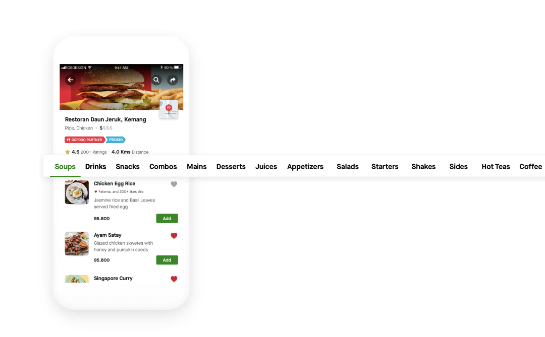
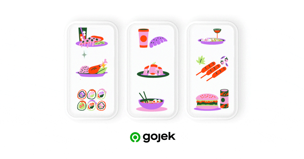
Those are great food options, but the list went on and on (Average for most restaurants on GoFood), and the long scroll made it hard to browse through the menu. Having as many restaurants and dish options was what made GoFood the largest food delivery app in Southeast Asia. It was also what customers loved — options, choice, variety. You name it and we have it on GoFood. But, in some way it was also hurting us, it made choices harder.
A classic example of Hick’s Law in action. Coined in 1952, this law implies: More the choices, the longer our users took to find what was needed. The variety, no matter how good, gave way to an exhaustive menu, or at least created the perception of one.
Stifling choice from a restaurant wasn’t a solution or an option. What we needed was a Hobson’s choice. Our version of Hobson’s choice was straightforward. Design was roped in to mould this behaviour:
Kill the overwhelming feeling of ordering food, focus on persuasively getting a customer to order, with the illusion of a few.
Problems galore — as always?
Dissecting the menu design: We got to the drawing board and started speaking to our users. As we chartered out everything we were doing wrong and broke down all the pain points, this is what we found out ?
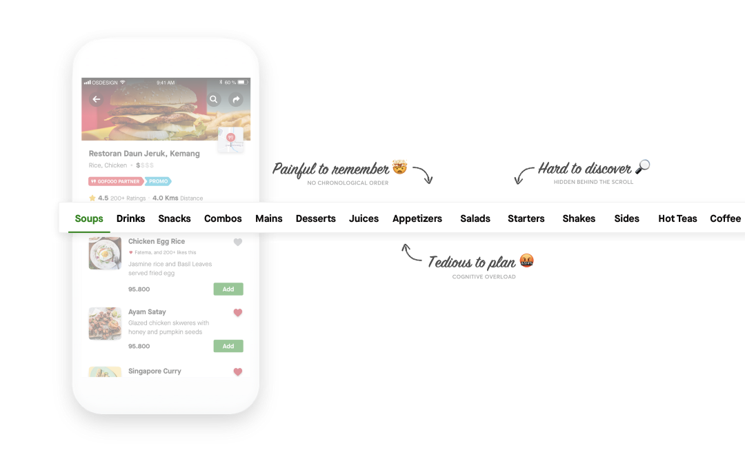
Pain point one — Discovery ?
The first thing you want to do when you plan your meal is to decide on the category. The age-old basics: Mains ? , Starters ? Salads ?.
But, the scrollable categories made this decision less efficient: Users still had to scroll multiple times before they were even allowed to see all the options available.
The categories hidden behind the scroll were hard to discover. It dissuaded our users to quickly make informed decisions.
Pain point two — Recall ?
If you scroll from the first category to the last, (let’s say from soups, to beverages), you run the risk of remembering the positioning of the rest of the categories. This is also known as the ‘Serial position effect’ — It describes how we tend to remember items sensed at the beginning and end of an experience, more than ones in the middle.
This hotchpotch added to the users’ pain point of ordering food in a timely fashion.
Pain point three — Anxiety ?
Recall and discovery being the main problem, irked our hungry users. For users who were exploring options, they had to do this for at least 2–3 restaurants before finding what they liked. More frustration + loss of orders. Planning a meal became tedious.
Talk is cheap, what next?
Rethink the menu and make them simpler. While yes, managing the content itself was a long-term solution, but at that moment we needed was to rethink our navigation to enhance the usability of our menu. This was important to get a customer to order faster, and critically, not drop-off.
But rethinking the menu design came with its risks, as it is one of the most crucial steps in the ordering funnel. Any changes on this would also change how millions of users interacted with our app — Horrors of working at scale. So before jumping into iterations, we gave ourselves some principles to work with:
- Keep it simple: Nothing fancy. No snazzy patterns or interactions. It had to work on any device, regardless of internet speed.
- Keep it obvious: While designing for a large set of users, it is important to remember different people have different cognitive intelligence. We didn’t want anyone to struggle with the change — the idea was to not reinvent, but to keep the designs obvious and easy to use for all our 20 million users.
- Keep it accessible: Position and placement options were to be well within the ‘thumb touch’ area because phones are not getting any smaller. The average screen size of phones have always increased in the last few years.
After this, we went onto defining our success metrics to have a clear idea on what success would look like.
Having our goal predefined helped the team align on a common vision, it kept us strapped to the original problem while we explored possible solutions.
To reiterate: The Goals ?
1. Reduce time taken for our users to order food.
2. Decrease the drop-offs at the restaurant page.
After days and nights of iterating and testing, we finally had a new design.
Stay tuned…

